Tuesday, 23 December 2014

audience reserch

Our film would mainly appeal to females as they are attracted more to romantic fantasy films.
However, it could also appeal to males as later on in the film there may be some action and adventure aspects. 
The age range for our film is age twelve to eighteen as the character is seventeen years old but older people may be attracted the film up to the age of fourty as they might have read the books or just enjoy the genre. This is why younger children below the age of twelve may not like the film or be attracted to it as they will not understand the storyline of the film so they will be confused as it is quite a confusing tension filled film. Girls may also prefer this film rather than boys as boys are more into sci-fi and action films, whereas girls are attracted to films where they can connect with the characters emotions and express feelings from it although it is a fantacy it is still filled with emotion.

In comparison other films which include fantacy and romantic emotional situations in their genre are twilight, The secret circle and beautiful creatures. The secret circle would be aimed more at tv watches so people into other series like the vampire diaries as it includes more of a romantic aspect and is on evening tv. Beautiful creatures is the film that is most similar to ours as it focuses on the struggles of a teenage witch who is coming of age and shows the relationship she has with her family and friends. Twilight was a hit sensation with all ages and genders and was the main foucous when we were looking at how to market our film.

Wednesday, 17 December 2014

Changes we made to the title font

The changes we had made were that originally we had a pale yellow font for our titles I have learnt that this colour looked unprofessional and 'tacky' from this we ended up using a dark maroon colour this looked good on some of the lighter less woody shots but in the more woody shots it was almost unrecognisable. If we were going to make further changes we would change this to a more suitable colour.
We have used Adobe Carlson Pro as the typeface. We think this looks professional and not too modern as we wanted to go for a more rustic traditional style.

Tuesday, 16 December 2014

this is a photo of our risk assessment


the script

This is the updated version of our script, we kept the dialogue short and simple this was to allow the audience to conect and get a feel for the clips without being influenced by too much dialogue.

Voiceover Script 
I never wanted any of this to happen, ever since i found out about this curse of witchcraft, everything has gone downhill. my life has been turned upside down. it has all spirealed out of cotrol. i want to rewind back time to when none of this was ever an issue, back when everything seemed so ordinary, now id prefere ordinary.

it seemes as if i have lost everything friendship, emotions, and even my mind. i dont understand, why? why me?

i wish i could just rewind


i wish i could just rewind

Sunday, 14 December 2014

The Mise en scene for our film

MISE EN SCENE: 
Settings and Props- Costume, Hair and Make Up
- Facial Expressions and Body Language
- Lighting and Colour
- Positioning of Characters

As our film sequence is mainly all outdoors, this makes finding a location a lot easier. We plan to film at Galley wood common and a selection of other places like great baddow high school. We were thinking about other woodland areas but we decided that this one was ideal as it is quite big and picturesque but also close us meaning that we could get there easily without hassle. It was the perfect setting for the look we wanted. 

Our costumes are also quite simple as well as there is only one character in the opening this meant that we only had to develop one style, although there is also other characters that are featured in the opening these were only shown for a split second so we didn't have to focus on their attire hugely. We decided that the main character Eva should be wearing a beautiful long navy chiffon dress, This was to convey a grand feel this would only be in the first scene and with the use of setting it would cause the audience to question things. Whereas Eva in the other scenes she will be wearing more casual clothing these will be slightly dark and gothic. The costume of the other characters that are featured in the rewind will be casual, teen like, something you would wear to collage. 

Facial expressions will be important in our sequence as Eva is supposed to be quite a mysterious character and within the first min of the film she is shown to be 'dead' she then opens her eyes revealing that she isn't. Facial expressions will also be important when Eva is shown in the rewind, here she is shown to be quite confused and scared then her mood seems to lighten up as the clip progresses showing her as a happy individual

Although lighting is quite hard when we have a limited amount of time to film, we are going to try our hardest to get it all in the day time when the camera quality will be the best. This is also because we are trying to represent everyday life. we would try and film the first scene more towards the late afternoon this is so that due to the current weather implications we would be able to film before its pitch black but late enough so that it is not really bright as we were trying to make the opening scenes feel quite dark and mystical. 

The main focus of the sequence is Eva so she will be on camera the most. It should be clear that she is the main character as she is the first person to come on screen and the main focus in following first couple of minutes.

changes to the shot list

Due to us changing the narrative of the opening it meant that we would have to change the shot list, the shot list now contains two scenes
Scene 1- This will be shot in the woods (Galleywood Common) this is initially a scene from the middle of the film. The only character it contains is Eva. The camera pans through the woods like it is looking for something them stumbling across Eva.
Scene 2- This contains a collection of mini scenes they would be speed up and and played in reverse to show that the film is being 'rewound to the beginning' this is ironic due to Eva saying in the first scene that she wishes she could 'just rewind back to a time when witchcraft didn't run her life'

The mini scenes include

    • One of her walking to her mothers grave
    • walking from her home
    • ones of her and her friends in school messing about
    • library scenes researching witchcraft
    • ones of her in a car
    • ones of her practicing magic
    • going to a creepy cottage 

Music Update 2

A recurring comment that we received about our first draft was that the music we used was too much like a Daytime TV program and not like a film opening. Initially we were going to use the song moonlight stanza by Beethoven but this was to heavy for our first draft we then changed it to the instrumental version of Mazzy Stars Fade into you, but this belonged more on TV.
Olivia then set out to find another song, whilst sam wrote the script and I began to edit the videos, The song she decided to use was called Soda by the Cinematic Orchestra this would be played in the opening scene. For the 'Rewind' scene she decided to use the song Breath Me (instrumental) by Sia we will discuss this further on Monday the 15th.

Poster Drafts

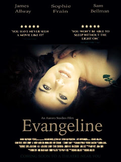
Bellow is a selection of poster ideas that I have created using screenshots from the clips we filmed in the woods, I edited them on the iPhone app called Line Camera although they were edited on my iPhone they still came out very professional looking. They are only rough designs and I will use the basic design of the one that gets the best feedback and re create it on more professional software like Photoshop. The inspiration for the posters came from the film twilight, The posters for this film are all quite grand and mythical they feature

  • Two comments from big newspaper and magazine companies, 
  • The names of the three main characters, 
  • The title in big font underneath the main image,
  • In smaller font the production company is placed above the main title.
  • Bellow the main title is the basic information about the film including who produced it etc.
  • Right at the bottom of the poster is the quote that is found on many posters 'COMING SOON TO A THEATRE NEAR YOU'
For a selection of the posters they have a gold tint to them this gives the feel of royalty and something grand it is also very mysterious and suits the genre well. all of the images on the posters corners fade to black around the edges this gives the effect of something more questionable it is also an effect commonly used on film posters. The images I chose to use are quite mysterious and mythical within themselves, they both cause the audience to question the film and want to know why she is laying where she is in a dress? The images and the layout are both affective on the reader causing them to want to watch the film and find out what its about.

Monday, 8 December 2014

what we need to do for poster

design ideas for both landscape and portrait 
chose designs
design bus poster
re shot the libary scene with the final actors
take the photos of the actors that we shall use in the posters 
upload
play around with them
create the final designs
compare pick the final one
upload to blog and analyse 


Peer Marking

These are photos that show my class peer marking each others first drafts.

Sunday, 7 December 2014

reflections

Thought the process of year 12 I have learnt a lot of new things including how to work different programs like adobe photoshop, premere, prezzi, and slide share none of these had I used before doing the course
If I were to mark what I had done so far on my blog I would give it 13 out of 20 this is simply because there are some aspects that aren't fully complete or that I haven't uploaded and this therefore makes my blog look incomplete, I also haven't given it a higher mark because I don't believe that the posts that are complete are all up to the standard that they could be.

Saturday, 6 December 2014

final music

We changed the music from Beethoven's Moonlight Sonata to something less well known. we have decided to use 'Mazzy Star- Fade Into You Karaoke' because it fitted with our genre better. It isn't too happy, tense, scary or cheerful. It is quite natural (the simplistic guitar sound) and fits well for a teenage girl walking alone in a natural environment.

Moonlight Sonata created an atmosphere which was too dramatic. It gave across that it was a horror film from the first few shots because its dark, tense 

timeline

This is timeline to show where the different titles appear in the opening scene.
This was very helpful when creating all of the titles when editing the film because it gave us a correct order to put them in, which is the same as 'The Craft' (a film with a similar narrative to ours).We made all of the titles roughly 4 seconds and made them fade in and out when editing our film. We only had one title shown in the library (at the end) because it looked better when the titles were shown without dialogue and lots of colours in the background. Wheres it was easier to include titles in the shots of Eva walking because the background was mainly dark colours (green and grey).

synopsis planning

Scene 1- A range of shots as Eva is walking. She is located outside Galleywood Cemetry, walking along the path, and headed towards the graves.

Scene 2- Establishing characters in the library and what they are doing.
Scene 3- Eva walks up to her Mothers grave and then the main title is shown.
Scene 4- The film cuts back to the library and Faye starts off by reading a passage about witchcraft. The library group become inquisitive about Eva's whereabouts so they call her.
Scene 5- Eva is seen walking up to the library and over to join her friends. They all gather their bags and exit the shot, the camera then zooms in on a computer screen with the page up of 'Local Legends of Witchcraft' (it zooms into Evangeline's photo)

Story Board.


This is the story board we created for our film. We have filmed each image and included a voice-over to make it easy for someone to understand how each shot will look. The images were drawn by me but our storyboard was a group effort because we had to decide on the shots we wanted, their order and how they would each look.

Visual mood board

props that we will use

We will need a large table in the library for the group of friends to sit around. On the table there will be;
  1. Notebooks, Pens, Paper (the group will be attempting to research for their history witchcraft project). 
  2. A laptop which someone on the table is using and a computer behind the table with the witchcraft blog loaded up on the screen. On this blog there will be a photograph of  the late witch 'Evangeline' which is who the film spirals around. The photograph will be of the actor who plays Eva (Sophie Frain) so it is clear to the audience that Evangeline looks like Eva. However the girl in the photograph will be wearing old fashioned clothes. The photograph will be 'black and white' to make it look like it was taken many decades ago.
  3. Witchcraft books on the table in the library
  4. Printouts of witchcraft to go on the table
  5. 3 laptops and two computers that are to be used but surrounding ones to set the scene.
  6. basketball
  7. gym bag
  8. glasses for Faye to wear
  9. pens
  10. notebooks
  11. phone x2

Music


This is the  instrumental music we are going to use for when Eva is walking. It will also play when the institutions and titles are shown.
It will set the mood well and fits in with her being alone and walking through a graveyard. It is quite emotional music so will set the mood right for the audience. It will make them feel the way in which we have intended them to feel.


Our film institutions

We as a group researched different production companies that we could use for our film, initially we chose Warner Bros but after discussing it we realised that they weren't the right company and we should go for something smaller, we are going to use Haxan Films to produce our film they are well known for producing an independent film called The Blair Witch Project this is really similar to our film meaning that it would be the perfect company.
The fact they are a small company and produce independent films is good because our film is also an independent film.
the name of the company itself is great for our film as it relates to the theme of our film which is 'witchcraft'. Haxan got its name from the 1922 Swedish/Danish silent movie Haxan ("The Witch").

We are going to use my film company to distribute our film, it is called Aurora Studios. Out of each of our film company logos in our group we chose mine because it looked grand and therefore looking powerful. It also catches peoples attention because of the bold lettering and bright colours which make the Institutions of our film clear to the audience. the reds and yellows that are used in the image are good because they give of a powerful feel making the audience believe that what they are going to watch is going to be good.